
Overview
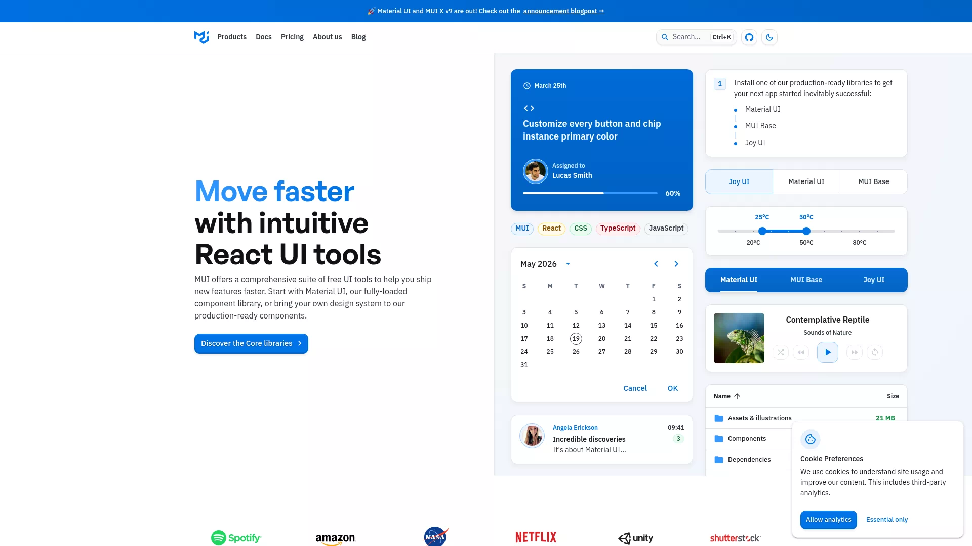
MUI is an open-source component library for React that provides Material Design–compliant, high-quality UI components, a theming system, and comprehensive examples and documentation to help developers and design teams deliver quickly from prototype to production.
Key features
- Comprehensive component set: Buttons, forms, navigation, data display (including MUI X data grid), and other common components.
- Customizable theming: Supports deep theme customization, dark mode, and responsive design.
- Modern styling options: Compatible with
emotionandstyled-components, and provides the systemsxstyling API. - TypeScript & accessibility: Built-in
TypeScripttypes and accessibility (a11y) considerations. - Extensive docs & examples: The website includes component APIs, interactive examples, and runnable templates.
Use cases & target users
Suitable for building admin panels, dashboards, enterprise apps, design systems, and front-end prototypes. Target users include front-end engineers, full-stack developers, UI/UX designers, and teams that need to rapidly create consistent interfaces.
Main advantages
- High developer productivity: Ready-to-use components and examples significantly shorten development cycles.
- Highly extensible: Theme and styling mechanisms make it easy to extend and customize.