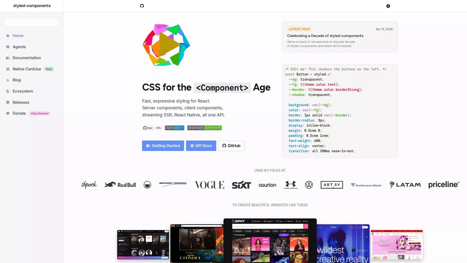

Styled Components
Frontend Frameworks
Component-level CSS-in-JS styling solution
Introduction
styled-components is a CSS-in-JS library that binds styles to React components using template literals, enabling component-level style encapsulation and theme support. It generates unique class names to avoid conflicts and is compatible with server-side rendering (SSR) and automatic vendor prefixing.
Core features and highlights
- Co-locates CSS with components to eliminate class name collisions and style leakage
- Implements dynamic styles and conditional styling via
props - Supports a theme system for convenient global style management
- SSR-friendly: injects styles on demand to improve initial render performance
Use cases and target users
Suitable for React developers, frontend engineers, teams building design systems or component libraries, and medium to large projects that prioritize maintainability and composability.
Key benefits
- High maintainability: styles tightly coupled with component logic, making them easy to understand and refactor
- Reusability: styled components are composable and shareable, facilitating design system construction
- Performance and ecosystem: on-demand style loading, SSR support, mature community and rich plugins
Using styled-components makes style management more modular and predictable, and accelerates component development.